20 Universal Design Rules for AI Design Superpowers.
Twenty research-backed rules — pulled from Tufte, Reynolds, Refactoring UI, NN/g — codified once into the Power Design Claude skill. So the design takes care of itself, every slide.
The twenty, distilled.
Twenty rules — one viewport. Each links to its full plate below.
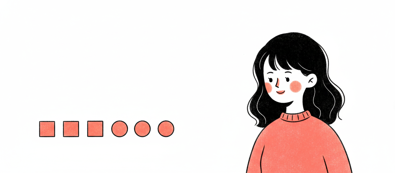
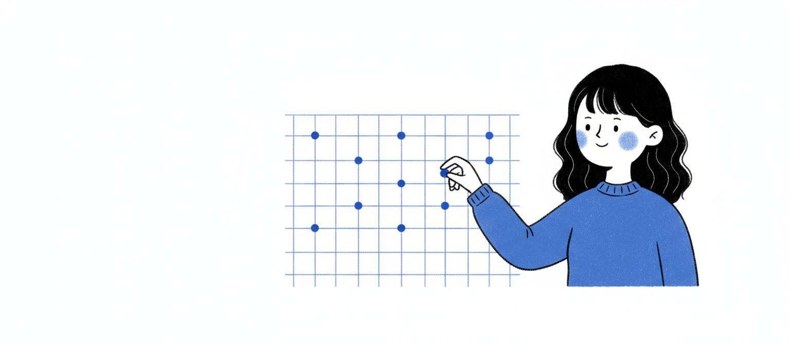
Miller said 7±2; Cowan revised to 4. Slides are scanned, not studied — use the stricter limit. Group atoms with proximity so the brain perceives chunks, not items.
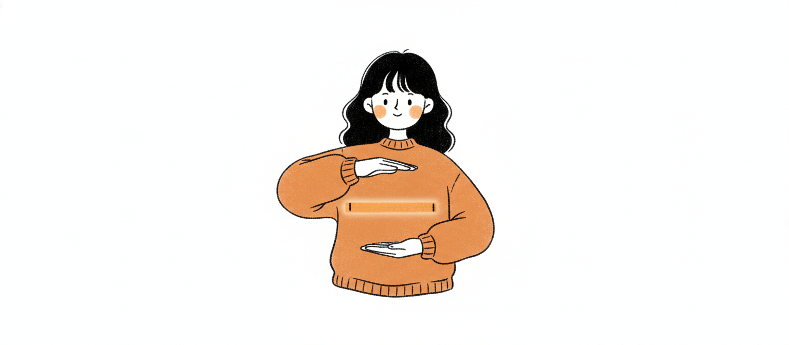
The rule≤7 distinct visual chunks per slide; aim 3–5. Use proximity to bind atoms into chunks.
Miller, The Magical Number Seven (1956). Cowan, The Magical Number 4 (2001).
04
Spatial · Refactoring UI; Reynolds
Forty percent empty.
#0EA5E9
Whitespace isn't where the design ends — it's where the design lives. Cramped slides feel anxious. Hero slides want ≥60%; standard ≥40%.
The rule≥40% of slide pixel area must be empty. Hero slides ≥60%.
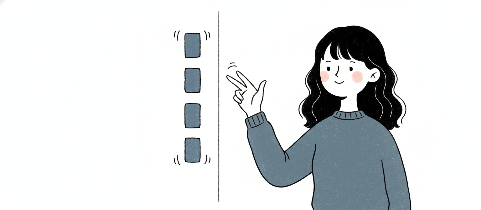
Borrowed from broadcast TV. No critical content within 5% of any edge. On a 1920×1080 canvas that's a 96-pixel breathing band. Crops, projector overscan, and audience eye-paths all start there.
The rule5% safe-zone every side. ≥96px from edges on 1920×1080.
SMPTE/EBU title-safe convention. Apple Human Interface Guidelines.
06
Typography · Tschichold; Bringhurst
Pick a ratio. Derive everything.
#6366F1
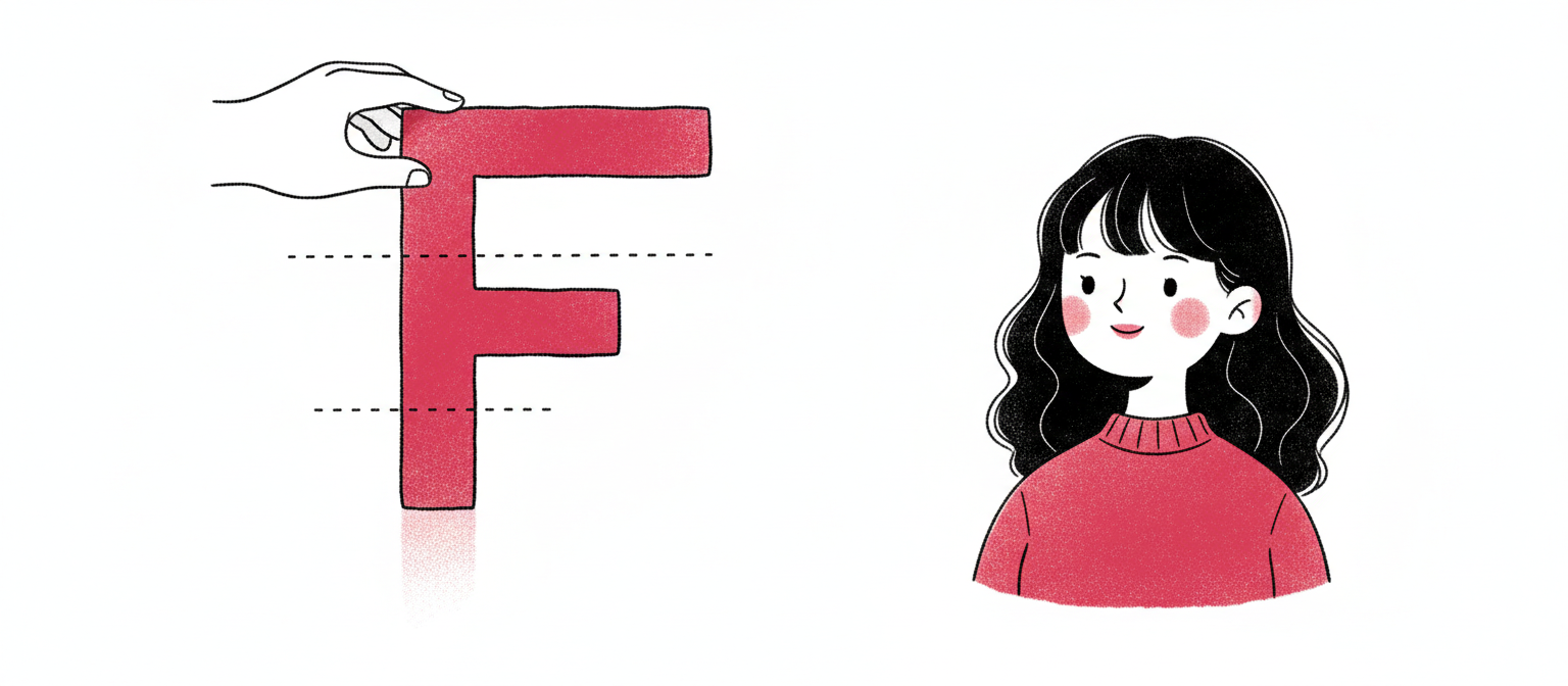
Type sizes shouldn't be invented. Pick one ratio — 1.25, 1.333, 1.414, 1.5, or the golden 1.618 — and let every size on the slide derive mathematically.
The ruleChoose one modular ratio. Compute the scale. Emit only those sizes. No ad-hoc.
Body text below 24px on screen — or 28pt for projection — is unreadable from row 10. Title floor: 48px. Caption floor: 18px. Anything smaller assumes the audience moves to your laptop.
The ruleBody ≥24px (screen) / ≥28pt (projection). Title ≥48px. Caption ≥18px.
Slides shouldn't have paragraphs to begin with. If they do, cap line length at 60 characters. Anything wider and the eye loses its place between lines.
Aim seven. Settle for nothing less than four-point-five.
#7C3AED
WCAG AA — 4.5:1 body, 3:1 large — is the floor for screens. For projection, design at AAA (7:1) because projectors wash 30–50% of contrast in a real room.
The ruleContrast ratios — body ≥4.5:1, large text ≥3:1, projection target 7:1 (AAA).
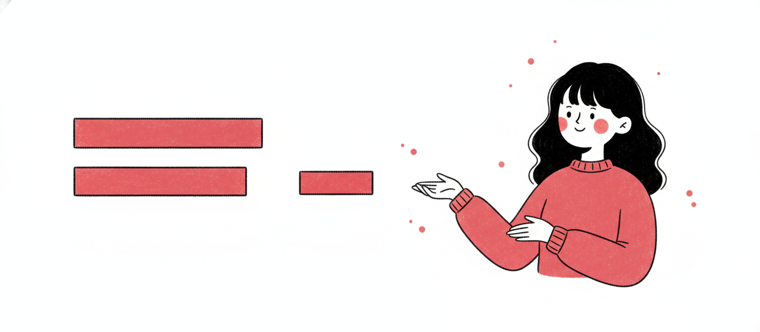
Sixty percent dominant (usually background). Thirty percent secondary (surfaces, structure). Ten percent accent — that's where the eye lands. Reverse the proportions and the slide screams.
The rule60% dominant / 30% secondary / 10% accent. The 10% earns attention.
Itten color theory (interior design tradition). Codified by Wathan & Schoger.
13
Color · Tufte
One accent. That's the budget.
#D946EF
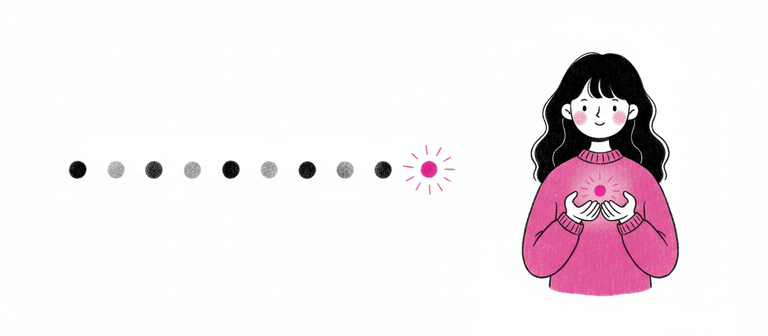
Two accents are no accent — emphasis cancels emphasis. One color earns the role of "the eye lands here." Everything else is neutral.
The ruleOne accent color per slide for emphasis. All other color stays neutral.
Every margin, padding, and gap a multiple of 8 (4 allowed for tight icon work). Use the canonical scale: 8, 16, 24, 32, 48, 64, 96, 128. Never 13. Never 27.
The ruleAll spacing values ∈ {8, 16, 24, 32, 48, 64, 96, 128}. Never ad-hoc.
Proximity is the cheapest grouping signal. Items related to each other ≤16px apart. Items unrelated ≥48px apart. The eye groups by gap.
The ruleRelated items ≤16px apart. Unrelated items ≥48px apart.
Gestalt principle of proximity. Williams, The Non-Designer's Design Book (CRAP).
18
Density · Tufte 1983
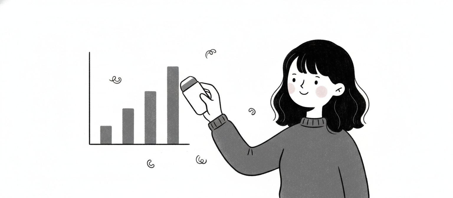
Eighty percent of the ink should be data.
#27272A
Strip every chart pixel that isn't carrying meaning. No 3D. No gradients. No drop shadows on bars. No redundant legends. No decorative gridlines. The data IS the design.
The ruleData-ink ratio ≥80%. Remove all decorative chart elements.
Tufte, The Visual Display of Quantitative Information (1983).
19
Hierarchy · Nielsen Norman Group
Top-left, or invisible.
#BE185D
Eye-tracking is unambiguous: attention enters top-left, sweeps right, drops, sweeps right, drops. The first 200 vertical pixels are the primary attention zone. Headlines and key visuals belong there.
The ruleHeadline + key visual in the top-left to top-right band. First 200px vertical = primary attention zone.
Two valid modes exist. Presenter mode — sparse, image-led, ≤15 words/slide, narrated live. Document mode — denser, hierarchical, sent as PDF, read on its own. Both are correct. Mixing them in the same deck is what makes audiences hate slides.
The rulePick one mode per deck. Presenter ≤15 words/slide. Document allows short bullets but stays hierarchical. Never mix.